2010 Pantone Color of the Year: Turquoise
Turquoise 15-5519 — the blue-green of tropical water, protective stone and open sky.
The Pantone Color of the Year for 2010 was Turquoise, PANTONE 15-5519 — a blue-green drawn from water and sky. In many cultures, Pantone noted, turquoise is believed to be a protective talisman, a color of deep compassion and healing, and a color of faith and truth. Years of color word-association studies added a second reading: to many people, Turquoise represents an escape, taking them to a tropical paradise that is pleasant and inviting, even if it is only a fantasy.
Whether it is envisioned as a tranquil ocean surrounding a tropical island or as a protective stone warding off evil spirits, it is a color most people respond to positively. Pantone called it universally flattering, with appeal for men and women, translating easily to fashion and interiors alike — a practical choice for a year when wardrobes wanted brightness without risk.
A Blue-Green With Both Temperatures
Most strong colors lean one way: warm reds and oranges on one side, cool blues on the other, and never the twain in one outfit. Turquoise refuses the split. With both warm and cool undertones in a single swatch, 15-5519 pairs nicely with any other color in the spectrum, which is why stylists reached for it so readily in 2010. It could cool down a hot palette or wake up a cold one, and it rarely clashed.
On skin, that balance is the flattery. A purely cool blue-green can drain warm complexions; a purely warm one can look muddy on cool skin. Turquoise sits in the middle of the seesaw, so the same shade of dress, shirt or scarf reads well on wearer after wearer — the quality every Color of the Year hopes for and few achieve.
Pairings: From Maritime to Yellow-Green
Pantone's own pairing notes for 2010 read like a wardrobe plan. Turquoise adds a splash of excitement to neutrals and browns — think of it against khaki, camel and chocolate in resort wear. It complements reds and pinks, its near-opposites, which is why turquoise jewelry has sat on coral-red dresses for generations. With deep blues it creates a classic maritime look: navy blazer, white trousers, one turquoise accent.
It also livens up all other greens, deepening a green palette rather than competing with it, and Pantone singled out one forward pairing: Turquoise is especially trend-setting with yellow-greens, the sharp chartreuse family. In practice that meant turquoise worn inside tropical prints, where blue-green water meets yellow-green foliage, and in color-blocked swimwear and summer knits.
Where Turquoise Works Hardest
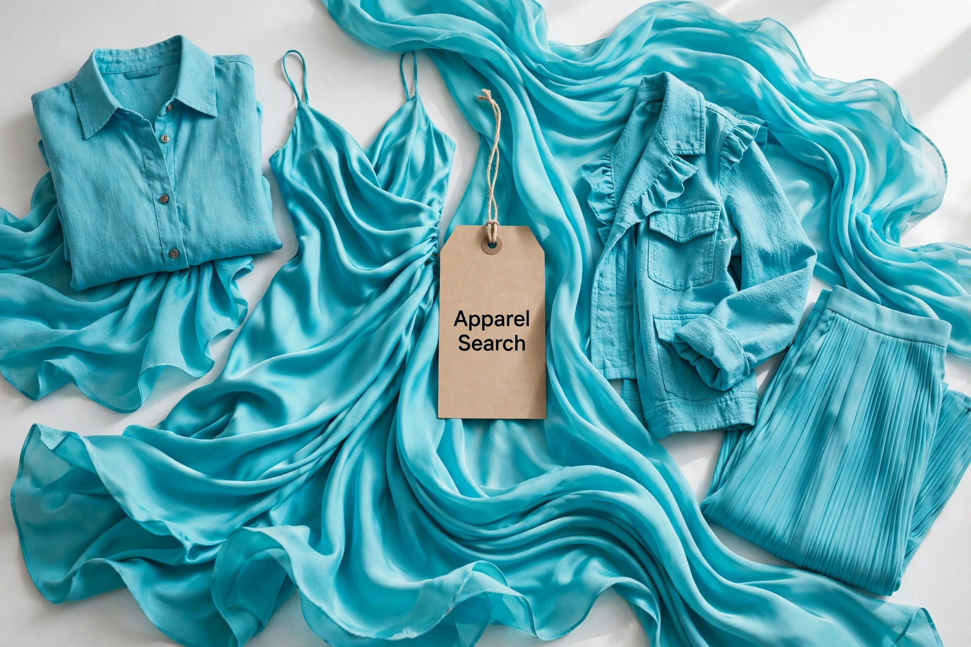
Resort and swim are its home turf — no color photographs better against sand and pool water — but 2010 took it well beyond the beach. Turquoise silk blouses and shift dresses carried it into offices, turquoise stone and enamel jewelry gave black evening wear a single point of color, and men's shirting and ties used it as the bright note in an otherwise conservative outfit. In interiors it did the same work on cushions, glassware and painted furniture: one piece was enough to make a neutral room feel like a holiday.
Fabrics matter to the effect. Matte cotton and linen keep turquoise casual and sunlit; silk and satin push the same hue toward gemstone richness, closer to the protective stone that inspired it. Either way, the color's promise held for the whole of its year: a small, wearable escape, built into clothes people already owned.
Photos

Common Questions
Is Turquoise a warm color or a cool color?
Both, which is unusual and useful. Pantone 15-5519 carries warm and cool undertones at once, so it sits comfortably beside colors from either side of the spectrum and flatters a wide range of skin tones instead of fighting them.
Why is turquoise called universally flattering?
Because of that balanced undertone and its associations. Read as water and sky, it is a color most people respond to positively, and on clothing it works for men and women alike — in a full garment, a stone necklace or a single bright accessory.
What is the easiest way to start wearing Turquoise?
Against the neutrals and browns already in a wardrobe. A turquoise scarf, bag or pair of shoes adds the splash of excitement Pantone described without asking the rest of the outfit to change, and it livens up plain summer dresses the same way.