2000 Pantone Color of the Year: Cerulean
Cerulean 15-4020 — the calm, sky-remembering blue Pantone chose to open the millennium.
The Pantone Color of the Year program began with a blue. For 2000, Pantone named Cerulean 15-4020, a clear sky blue, as the color to represent the millennium — chosen, Pantone said, because of the calming, zen state of mind it induces. At a moment crowded with countdown clocks, technology anxiety and predictions about strained natural resources, the very first Color of the Year was not a shout but a deep breath.
Leatrice Eiseman, executive director of the Pantone Color Institute, explained the thinking in the announcement of April 26, 1999: gazing at a blue sky brings a sense of peace and tranquility to the human spirit. Sky blue, she said, is imprinted in our psyches as a retiring, quiescent color, and surrounding yourself with Cerulean could bring peace because it recalls time spent outdoors, on a beach, near the water — restful, relaxing times. It also makes the unknown a little less frightening, because the sky is a constant presence that is always there.
A Color Chosen for an Anxious Threshold
Few color announcements have had to carry as much symbolism as this one. The year 2000 was treated as a genuine threshold: a new millennium, a high-tech era arriving at full speed, and a public mood that mixed excitement with unease. Pantone described a paradoxical time — people moving toward an uncertain yet exciting future while simultaneously looking back, trying to hold onto the security of the past. Lifestyle movements of the moment pointed the same direction, suggesting consumers would seek inner peace and spiritual fulfillment in the years ahead.
Cerulean was Pantone's answer to that mood. Where a louder color would have celebrated, this blue consoled. It is worth remembering that the selection was announced in April 1999, months before the millennium itself, so it functioned as a forecast of feeling as much as of fashion: a prediction that the defining desire of the new era would be solace. Every Color of the Year since has followed the template this choice set — a hue presented as a snapshot of the collective mood.
What Cerulean Actually Looks Like
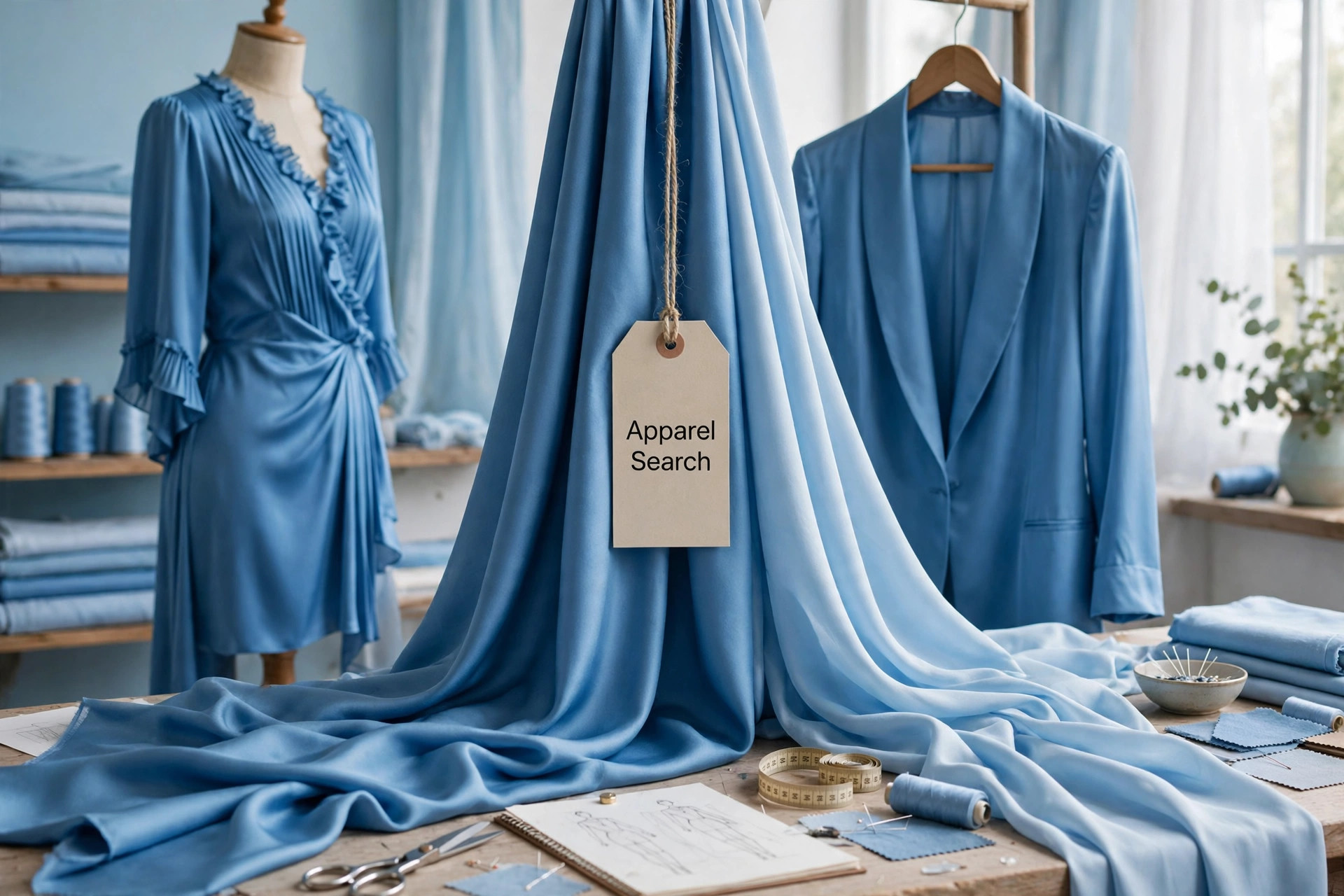
Cerulean is the blue of a clear midday sky, lightened and slightly softened. It sits well away from navy and from electric blue; there is air in it. On fabric it reads clean and open, which is why it flatters large areas — a Cerulean shirt, sweater or summer dress looks luminous rather than loud. The color also changes gracefully with texture: in smooth cotton poplin it is crisp and bright, in a matte knit it turns powdery and quiet, and in a slight sheen it can look almost aquatic.
Because it echoes something everyone sees daily, Cerulean rarely feels like a fashion risk. It pairs naturally with white for a fresh, coastal effect, with navy when a blue-on-blue depth is wanted, with soft grays for a calm workday palette, and with sandy neutrals that recall the beach associations Pantone itself cited. Small amounts of warm contrast — a tan bag, a coral lip — keep it from drifting into coldness.
Wearing the Millennium Blue
Cerulean's best fashion use is as a mood garment: the piece you reach for when an outfit should feel composed. Light blue shirting has never really left menswear or womenswear since, and 2000 is part of the reason why — the color was promoted not as a seasonal novelty but as a psychological tool. Knitwear in this shade suits nearly every skin tone because the blue is clear rather than grayed, and it layers well under charcoal, stone and denim.
For accessories, Cerulean works where a softer note is wanted: a scarf against a dark coat, a handbag in place of a neutral, or stone and glass jewelry that picks up the water association. In interiors and graphics of the period it appeared for the same reason it worked in clothing — it lowered the temperature of a room or a page. Two decades of later blues, including several more Pantone selections, trace back to the precedent set here: blue as reassurance.
Photos

Common Questions
Why did Pantone choose a blue for the first Color of the Year in 2000?
Because the millennium felt stressful and uncertain. Pantone said consumers entering the new millennium would be seeking inner peace and spiritual fulfillment, and that blue is known to calm — looking at it was described as lowering blood pressure, heartbeat and respiration. Cerulean was meant to produce that calming effect at a paradoxical moment when people were heading toward an exciting future while holding onto the security of the past.
Is Cerulean a bright blue or a soft blue?
Soft, and deliberately so. Cerulean 15-4020 is a clear sky blue with a quiet, retiring quality rather than the punch of a cobalt or royal blue. Its softness is the point: it reads as open air and daylight, which is why it works in large pieces such as dresses, shirts and knitwear without overwhelming the wearer.
What did Pantone connect Cerulean to besides the sky?
Water, and worry about it. The choice was also related to the water issues predicted around the world at the time and, more broadly, to concern about the exhaustion of natural resources. That is why the color carried an environmental undertone alongside its peaceful one — a blue for both the sky above and the water people feared losing.