2005 Pantone Color of the Year: Blue Turquoise
Blue Turquoise 15-5217 — a gentler, cooler turquoise, and the color of the sea.
After fire came water. For 2005, Pantone named Blue Turquoise 15-5217, continuing — as the announcement noted — the theme of nature from 2004's Tigerlily, trading the flower for the sea. Blue Turquoise was presented as the color of the sea, and as a calming shade that was also, not incidentally, a trendy one.
The name carries a precise instruction, and Pantone spelled it out: Blue Turquoise differs from true Turquoise in its gentler tone, with less green, which makes the color a bit cooler. This is turquoise walked a few steps toward blue and softened on the way — less tropical punch, more open water. Where the classic gemstone color shouts summer, Blue Turquoise murmurs it, and that restraint widened the places the color could go.
From Flower to Sea: The Nature Sequence
Pantone itself linked the 2005 choice to its predecessor, and the pairing is elegant: 2004 drew its orange from a land flower, 2005 drew its blue-green from the sea. Together the two years show the program's forecasters working a nature theme across opposite poles — warm and cool, land and water, energizing and calming. Nature references give a color story instant imagery, and few images are as universally liked as clear sea water over a pale bottom.
The sea association also carried the shade's emotional pitch. Seaside color promises escape, cleanliness and depth held at a safe distance. A Blue Turquoise garment borrows all of that: it is the color of holidays remembered and holidays planned, which made it as suitable for February resort collections as for high summer itself.
Less Green, More Blue — Why It Matters
Small shifts in a hue's balance change everything about its company. Classic turquoise, with its stronger green, demands warm partners and gold metal, and can fight with denim and navy. Pull the green back, as Blue Turquoise does, and the shade becomes bilingual: it still loves coral, sand and white, but it can also live beside slate, silver and mid-blues without a temperature clash. That flexibility is a large part of why the 2005 shade translated so broadly, from clothing into cosmetics and home goods.
On fabric the color has a watery honesty — it looks best in materials that suggest light passing through water: chiffon and silk that shift as they move, fine knits, washed cotton. Heavy matte fabrics mute it toward a pleasant but plainer blue-green, while a slight luster restores the sea-glass glow that makes the shade special.
Wearing the Color of the Sea
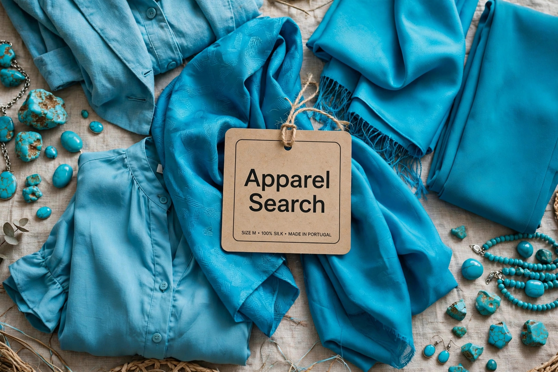
Blue Turquoise is resort wear's ideal citizen — cover-ups, sundresses, camp shirts and swimwear all take it naturally — but its cooler balance earns it city work as well. A Blue Turquoise blouse under a gray suit reads fresh rather than holiday-ish; the shade in a tie or pocket square livens navy tailoring with less risk than brighter turquoise carries. Jewelry is its historic home ground, and the 2005 selection sent designers back to turquoise-toned stones, enamel and beads, worn against sun-browned skin and white cotton.
Pair it with white for clarity, with navy for depth, with coral for the classic seaside contrast, and with tan leather for the beach-club effect. Avoid only one thing: matching it head to toe in a single flat fabric, which flattens the watery variation that is its charm. Broken across textures — a knit here, a stone there, a printed scarf — Blue Turquoise keeps the movement of the sea it was named for.
Photos

Common Questions
How does Blue Turquoise differ from true turquoise?
By temperature and gentleness. Blue Turquoise 15-5217 has a gentler tone and less green than true turquoise, which makes the color a bit cooler. Move a turquoise toward blue and soften it, and you arrive here — the difference between a vivid mineral stone and clear seawater. That cooler balance is also why the shade sits more easily beside blues and grays than classic turquoise does.
Was Violet Tulip the 2005 Color of the Year instead?
No — two different systems were involved. Blue Turquoise 15-5217 was the Pantone Color of the Year for 2005. Violet Tulip, Pantone 16-3823, was the Colorstrology Color of the Year for 2005 — a separate selection under a different banner. The two are sometimes confused because both were announced for the same year, but only Blue Turquoise holds the main title.
Why did Pantone describe Blue Turquoise as both calming and trendy?
Because in 2005 it genuinely was both. Blue-family colors carry the calming associations Pantone had used since Cerulean, while the turquoise family was simultaneously fashionable in clothing and jewelry. The selection let Pantone claim a shade that soothed like a blue and sold like a trend — a calming shade that the description itself also calls a trendy one.