2020 Pantone Color of the Year: Classic Blue
Classic Blue 19-4052 — a timeless blue, elegant in its simplicity, suggestive of the sky at dusk.
Color is critical to clothing, shoes, handbags and fashion accessories, and the fastest way to stay on trend is to know the hottest colors for the coming year. For 2020, Pantone's selection was PANTONE 19-4052 Classic Blue — a timeless and enduring blue hue, elegant in its simplicity.
Suggestive of the sky at dusk, the reassuring qualities of the thought-provoking Classic Blue highlight our desire for a dependable and stable foundation on which to build as we cross the threshold into a new era. After the neon-adjacent energy of Living Coral in 2019, Pantone deliberately chose calm: the most familiar color in the wardrobe, given the year's highest honor.
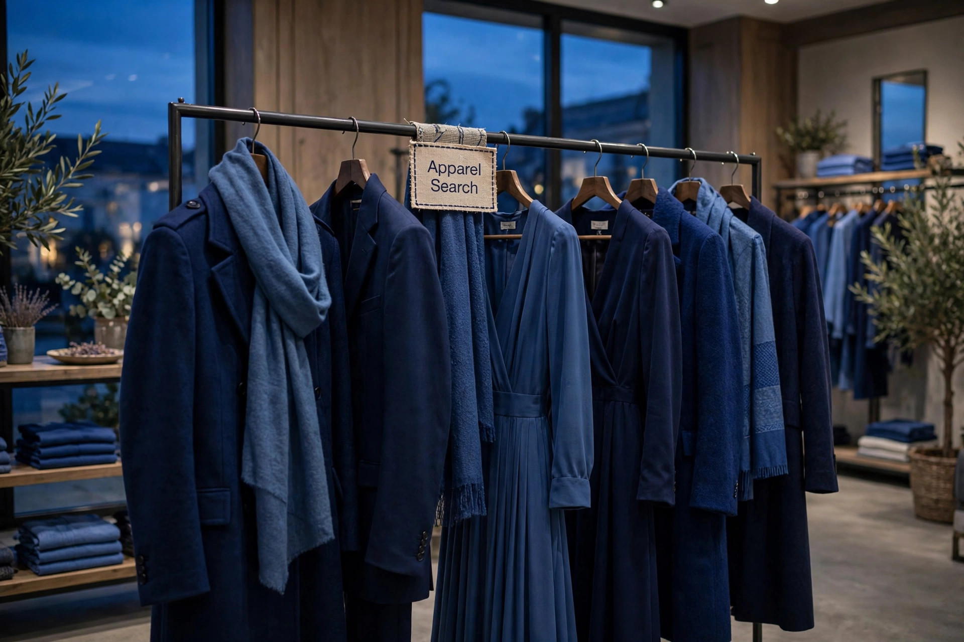
A Foundation Color for a New Era
Every Color of the Year is a reading of its moment, and the 2020 reading was about trust. Classic Blue is the shade people already rely on — the navy blazer's deeper cousin, the denim family grown formal, the color of work clothes and evening clothes alike. Pantone's announcement leaned on exactly that dependability: a stable foundation, offered at the moment one era gives way to another.
That is also why the choice travels so easily between industries. A foundation color does not ask a wardrobe, a product line or a room to be rebuilt around it; it underpins what is already there. Designers could take Classic Blue as a full garment color, a ground for prints, or the anchor shade in a palette — and Pantone published five palettes, covered below, to show the range of moods a single dependable blue can carry.
Peace, Clarity and Concentration
A reflective blue tone, Classic Blue fosters resilience. Imprinted in our psyches as a restful color, it brings a sense of peace and tranquility to the human spirit, offering refuge — the dusk-sky association doing quiet psychological work, since the sky at dusk is the day's own signal to slow down.
Pantone paired that calm with a working virtue: Classic Blue aids concentration and brings laser-like clarity, helping to re-center our thoughts. It is an unusual double claim for a fashion color — restful and focusing at once — and it explains the shade's reach into offices, uniforms and workwear as readily as into dresses. Few colors can promise a refuge and a sharper mind in the same swatch.
The Five Classic Blue Palettes
Pantone created five unique color palettes featuring PANTONE 19-4052 Classic Blue to help designers bring the shade into their work. Each palette conveys a different mood, illustrating the versatility of Classic Blue, and each is supported by three suggested color combinations.
Ponder. Surrounded by a palette of cool blues and an array of warm and soothing shades, thoughtful and meditative Classic Blue helps induce a gently calming effect and feelings of peaceful tranquility to the human spirit.
Snorkel. Evocative of a bliss-filled tropical paradise, this enchanting color story transports us to an idyllic destination. The addition of a classic black and white creates a dramatic contrast with the depth and strength of Classic Blue, providing the anchoring foundation.
Desert Twilight. Suggestive of the early evening sky, the boundless Classic Blue creates an elegant backdrop for a glittery grouping of sophisticated shades painted across the sky, adding illuminating sparkle to a Desert Twilight.
Exotic Tastes. An intriguing and adventurous potpourri of tastes and colors reflective of natural seasonings, condiments and blue foods. Foods in blue similar to Classic Blue are rich in anthocyanins, and with their relationship to wellness and self-care, help to build a solid foundation, acting as a form of protection for good health.
Untraditional. Nothing says untraditional better than an unusual and unexpected palette of colors. Standing at the helm is Classic Blue, a foundational shade that sets the stage for unique combinations and fun color mixes, as well as other outrageous and surprisingly shimmery fashion statements.
Classic Blue in the Design Studio
For designers working digitally, Pantone Connect — a time-saving color extension for Adobe Creative Cloud — includes five different pre-loaded color palettes featuring Classic Blue. These Color of the Year themed palettes, along with every other Pantone Color, are available to browse through and integrate directly into design files within Adobe Photoshop, Illustrator, and InDesign. Pantone Connect also offers designers an easy way to convert to Pantone from non-Pantone colors and collaborate on palettes with teammates.
Adobe Creative Cloud itself is a collection of 20+ desktop and mobile apps and services for photography, design, video, web, UX and more — from Photoshop on the iPad to drawing and painting with Fresco, and designing for 3D and AR. The practical effect for a fashion studio is that the year's defining shade arrives inside the tools where garments, prints and lookbooks are actually drawn, ready to specify rather than to approximate.
Wearing the Dusk Sky
In a wardrobe, Classic Blue's great advantage is that most people already own its neighbors. It deepens a denim outfit instead of competing with it, gives white summer clothing the crisp contrast the Snorkel palette describes, and turns black evening wear calmer and more modern. Against warm neutrals — camel coats, tan leather, gold jewelry — it supplies the cool, steady note that keeps an outfit from reading sweet.
Texture decides its register. Matte wool and cotton keep Classic Blue dependable and daytime; silk, satin and sequin push the same hue toward the Desert Twilight mood, a night sky with light in it. Fashion designers are welcome to develop their own color palettes around Classic Blue — the five harmonies above are simply the guidance Pantone put together, and a foundation color is, by definition, one that other colors can be built on.
Photos

Common Questions
What is the Pantone Color of the Year for 2020?
PANTONE 19-4052 Classic Blue — a timeless and enduring blue hue, elegant in its simplicity and suggestive of the sky at dusk. Pantone chose it for its reassuring qualities at the threshold of a new era.
Why did Pantone choose such a classic color for 2020?
Because of what people were asking of color that year. The thought-provoking Classic Blue highlights a desire for a dependable and stable foundation on which to build as we cross the threshold into a new era — and as a reflective blue tone, it fosters resilience.
What goes with Classic Blue?
Pantone built five palettes around it. Ponder surrounds it with cool blues and warm, soothing shades; Snorkel adds classic black and white for dramatic contrast; Desert Twilight sets it behind glittery, sophisticated evening shades; and the same blue anchors the adventurous mixes of Exotic Tastes and Untraditional.