2016 Pantone Color of the Year: Rose Quartz and Serenity
Two colors for one year — Rose Quartz 13-1520 and Serenity 15-3919, warm rose balanced with tranquil blue.
The Pantone Color of the Year for 2016 broke the program's own rule: for the first time, Pantone introduced two shades as the selection — Rose Quartz, PANTONE 13-1520, and Serenity, PANTONE 15-3919. A softer take on color for 2016, the blending of the two was the point.
Rose Quartz is a persuasive yet gentle tone that conveys compassion and a sense of composure. Serenity is weightless and airy, like the expanse of the blue sky above us, bringing feelings of respite and relaxation even in turbulent times. One warms, the other cools; the year was defined by the balance between them.
Why Two Colors? The Reasoning Pantone Gave
"As consumers seek mindfulness and well-being as an antidote to modern day stresses, welcoming colors that psychologically fulfill our yearning for reassurance and security are becoming more prominent," Pantone stated. "Joined together, Rose Quartz and Serenity demonstrate an inherent balance between a warmer embracing rose tone and the cooler tranquil blue, reflecting connection and wellness as well as a soothing sense of order and peace."
Read as a palette, the logic is thermal. A year dressed only in Rose Quartz might cloy; only in Serenity, might chill. Together they hold each other at room temperature — which is why the famous 2016 imagery so often showed the two melting into each other in a gradient, pink shading into blue with no hard border.
The Gender Blur, in Color
The prevalent combination of Rose Quartz and Serenity also challenges traditional perceptions of color association. Pantone explained: "In many parts of the world we are experiencing a gender blur as it relates to fashion, which has in turn impacted color trends throughout all other areas of design."
The statement went further, tying the pairing to societal movements toward gender equality and fluidity, the consumer's increased comfort with using color as a form of expression, a generation with less concern about being typecast or judged, and an open exchange of digital information that has opened eyes to different approaches to color usage. Pink for one gender and blue for the other was the old code; 2016 deliberately scrambled it, showing both colors on everything and everyone.
Wearing the Pair — and Each Color Alone
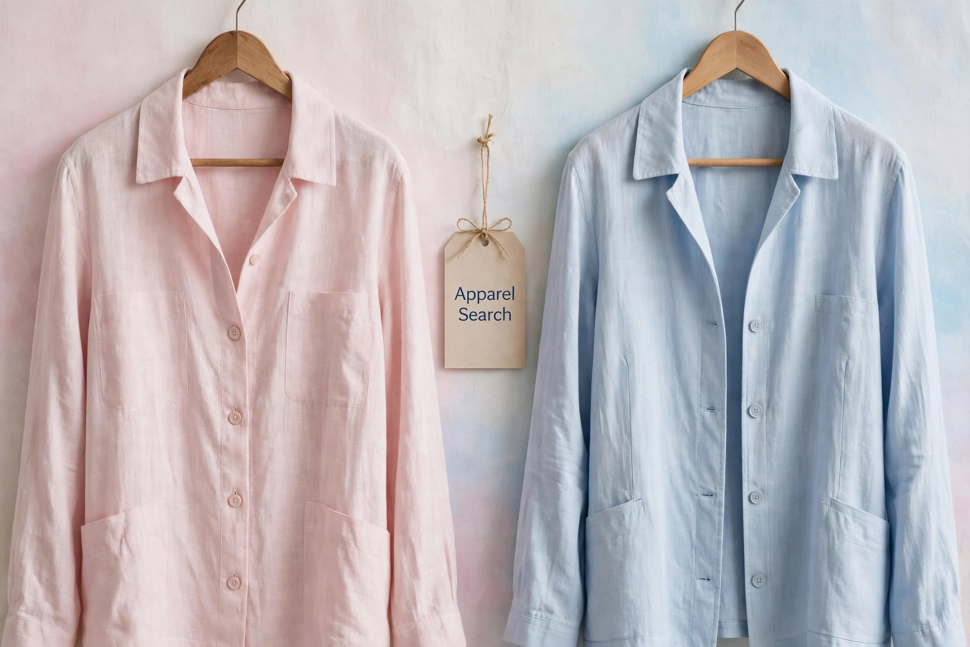
The signature 2016 look was the two together: a Serenity coat over a Rose Quartz dress, knitwear that ombrés from one to the other, sneakers and bags that split the pair left and right. In soft fabrics — cashmere, brushed cotton, silk, chiffon — the combination reads like dawn sky, and it flatters precisely because each color lends the other its missing temperature.
Alone, each has a separate career. Rose Quartz became the decade's defining soft pink: a near-neutral for blouses, tailoring and bridal parties that behaves like blush rather than candy. Serenity works as the calmest possible blue shirt, dress or knit — formality without navy severity. Both also share a talent for metallics, taking rose gold's cue on one side and silver's on the other.
Pantone LLC, a wholly-owned subsidiary of X-Rite, Incorporated, is the world-renowned authority on color and provider of color systems and leading technology for the selection and accurate communication of color across a variety of industries — the standard language for color communication from designer to manufacturer to retailer to customer. In 2016 that language simply spoke, for once, in two voices at once.
Photos


Common Questions
Why did Pantone choose two colors for 2016?
For the first time, Pantone chose a blending of two shades as a single selection. Joined together, Rose Quartz and Serenity demonstrate an inherent balance between a warmer embracing rose tone and the cooler tranquil blue — a pairing meant to reflect connection, wellness and a soothing sense of order and peace.
Which number belongs to which 2016 color?
Rose Quartz is PANTONE 13-1520, the persuasive yet gentle pink. Serenity is PANTONE 15-3919, the weightless, airy blue. Reproductions often show them side by side in one gradient swatch, but each color keeps its own number and name.
Do the two 2016 colors have to be worn together?
No. The pairing was the message, but each shade works alone — Rose Quartz as a soft warm neutral-pink, Serenity as a calm pale blue — and each pairs with plenty of other colors. The gradient combination is simply the most recognizably 2016 way to wear them.