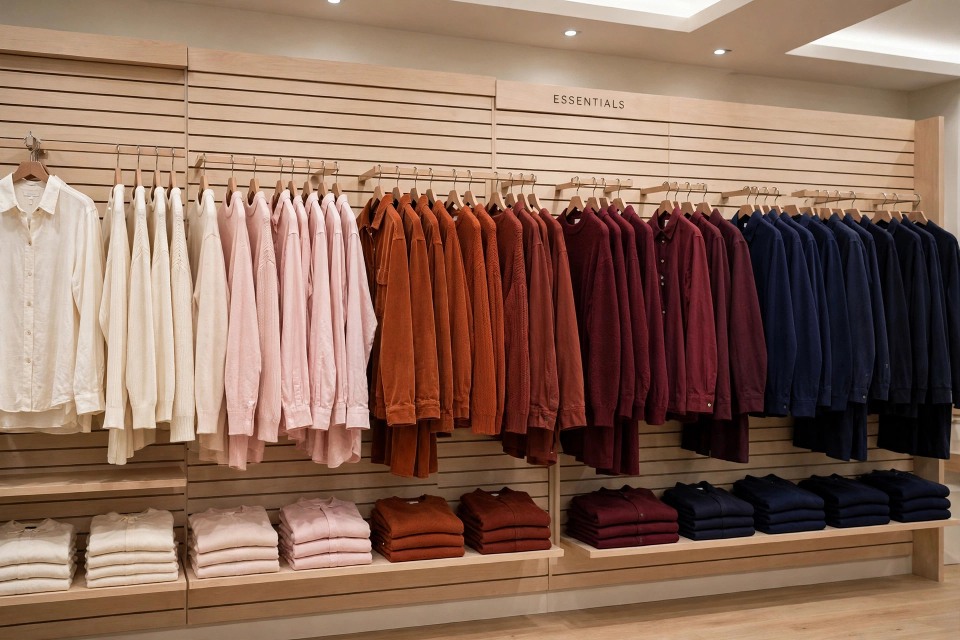
Stand in front of two rails holding the same clothes. On one, styles and colors are mixed as they came out of the delivery boxes. On the other, the garments flow in color order, hangers evenly spaced, sizes running in sequence. Same stock, different store — as far as the customer is concerned. This page covers the fixture-level techniques behind that difference, as part of our visual merchandising guide.
Color Blocking: Order the Eye Can Read
Color blocking groups garments by color so a fixture or a whole wall resolves into distinct color stories. It works for three reasons. It makes scanning effortless — the customer looking for a red dress sees in one glance whether the store has one. It builds outfits silently: styles sharing a palette sit together, so the cream knit, cream trouser, and camel coat present themselves as a look. And it manufactures abundance: six garments of one color read as a deliberate statement, while six garments of six colors read as leftovers.
The standard order runs light to dark — white, cream, pastels, mid-tones, brights, deep tones, black — though a featured color may lead the fixture when the season's story demands it, with neutrals used as visual rest between strong colors. Prints and patterns are usually grouped with the solids of their dominant color, or given their own block when the print is the story.
Building a Color Story Across a Department
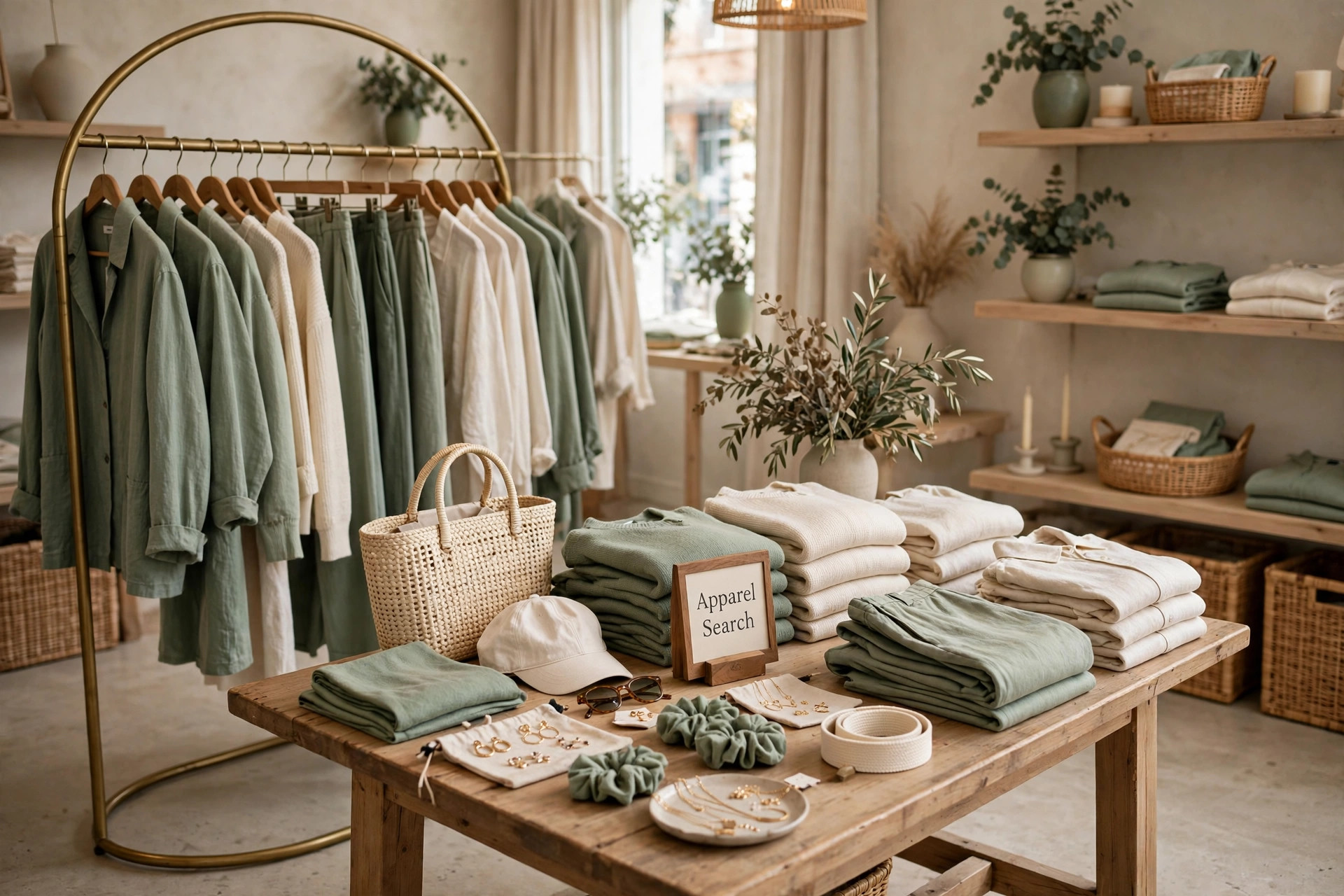
At department scale, color blocking becomes color story planning. A palette — say sage, cream, and clay — is carried across categories: the sage appears in knitwear, dresses, and accessories in the same zone, so the whole area hums one chord instead of each fixture playing a different note. Adjacent zones shift palette gradually, the way the gradient wall above flows cream to navy, so the customer's walk through the store feels like a progression rather than a series of collisions. This is the presentation layer of the placement decided in the apparel planogram: the plan assigns the fixture, and the color story decides how the fixture is dressed.
Capacity vs. Presentation Stock
Every fixture has two numbers: what it can physically hold, and what makes it look right. Presentation stock — hangers spaced a finger's width apart, folded stacks at even heights, no garment straining against its neighbors — is almost always the smaller number, and the difference between the two is where presentation goes to die. A rail crammed to capacity cannot be browsed: hangers will not slide, shoulders deform, and customers stop pulling garments out because putting them back is work. Discipline means holding reserve stock in the stockroom and replenishing the fixture as it sells — slightly emptier and shoppable beats stuffed and ignored.
Folding and hanging standards: folded garments share one fold width per fixture, stacks run in size order with the label or size cube visible, and hangers all face the same direction with garments buttoned or zipped as the standard specifies. None of this is fussiness — uniformity is what makes a fixture read as intentional at ten feet.
Tidying Standards: Recovery Is a Schedule
Presentation decays in direct proportion to how well the store is trading: every customer who pulls a size from the middle of a stack starts the unraveling. Recovery therefore runs on a rhythm — quick passes through each zone during the day (re-space hangers, re-order sizes, pull forward), a full recovery of focal fixtures at close or before opening, and immediate attention to any fixture a promotion is about to feature. Sizes left out of sequence and gaps left unfilled are not cosmetic faults; they tell the next customer her size is gone when it is sitting in the stockroom. The stores that look effortlessly ordered are simply the ones where tidying is treated as selling work, because it is.
Common Questions
- What is color blocking in a clothing store?
- Grouping garments by color on a fixture or across a wall so the merchandise reads as deliberate color stories rather than a mixed assortment. It helps customers scan, makes outfits suggest themselves across styles in the same palette, and makes stock look abundant and organized.
- What is the difference between capacity stock and presentation stock?
- Presentation stock is the amount that makes a fixture look right — evenly spaced hangers, full folded stacks. Capacity stock is the maximum the fixture can physically hold. Stores that stuff fixtures to capacity make garments hard to browse and damage the presentation the stock was meant to create.
- In what order should colors be arranged on a fixture?
- A common convention runs light to dark — whites and pastels through mid-tones to black — with the featured color of the story given the lead position. Whatever order a store chooses, it should be the same on every fixture so customers can shop by color without relearning each rail.
- How often should fixtures be tidied and recovered?
- Continuously in small passes during the day and completely at close or before opening: sizes re-ordered, hangers spaced, folds rebuilt, and gaps filled from the stockroom. A fixture is at its worst exactly when the store is busiest, so recovery is scheduled, not left to chance.
Back to the Visual Merchandising & Retail Display Guide
Return to the main guide for the full picture — windows, mannequins, layout, planograms, lighting, and presentation working together.