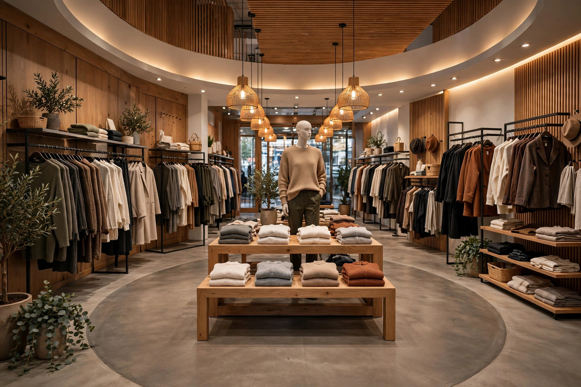
Most customers never see most of a store. They follow the path the layout builds for them, stop where the layout makes them stop, and leave by the route of least resistance. Planning that path — pattern, traffic flow, focal points, and service placement — is the subject of this page, one part of our complete visual merchandising guide. Fixtures themselves are covered by the retail store design and fixturing directory; here we deal with where they go and why.
The Decompression Zone and the First Impression
The first steps inside the door are the decompression zone: the five to fifteen feet where a customer slows down, adjusts to light and temperature, and decides whether the store feels right. Merchandise placed here is largely invisible — shoppers are not yet shopping. Good layouts respect the zone: a clear view into the store, one brand statement at most (a dressed form, the season's image), and the first real selling fixture placed just beyond it, where attention switches on.
Immediately after the zone comes the store's most valuable ground. Whatever stands here sets the customer's price and fashion expectations for everything behind it, which is why new-season, full-price stories usually take this position and clearance never does.
The Three Layout Patterns
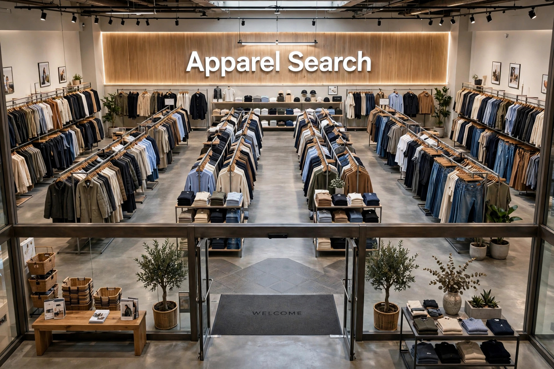
The grid layout runs fixtures in parallel rows with cross-aisles, like a supermarket. It maximizes selling space and suits large self-service and off-price formats, but its sameness can make departments blur together, so apparel grids rely on signage and feature ends to create variety. The loop or racetrack layout builds one main aisle that circles the store, with departments opening off it. Every customer on the loop passes every department, exposure is nearly total, and the pattern suits mid-size and department stores that want guided circulation. The free-flow layout scatters fixtures of different heights and shapes in an open, asymmetric arrangement — the boutique pattern. It holds the least stock, invites the most browsing, and depends entirely on focal displays to give the eye somewhere to go.
Traffic Flow, Sight Lines, and Focal Points
Customers in most countries drift right on entering and circulate counter-clockwise, which is a tendency to design with, not a law. What matters more: keep the main aisle genuinely clear (a minimum of about four feet, wider where two people with armfuls of garments must pass), avoid dead ends that trap browsers, and break long sight lines with mid-height fixtures so the store reveals itself in stages instead of all at once. A store fully visible from the door feels small and finished; a store that unfolds feels worth exploring.
Focal points do the pulling: a dressed table, a mannequin group, or a lit feature wall placed at the end of each sight line, carrying the newest or highest-margin story of its zone. A strong, consistently dressed feature wall has a second career, too — it is the natural backdrop for the store's own product photos and social content, which is why layout and the work described in our fashion photography and media production guide increasingly get planned together.
The back-of-store test: stand at the entrance and look for a reason to walk to the furthest corner. If nothing back there glows, moves, or promises, most customers will never go — and whatever is stocked there is paying rent without an audience.
Fitting Rooms, Cash Wrap, and Service Points
Fitting rooms belong toward the back or side — the journey to them passes merchandise — visible enough to find without asking, and close to the departments with the highest try-on rates. Their surroundings matter: a nearby rail for sizes, seating for companions, and staff presence, because the fitting room is where the purchase decision actually happens. The cash wrap is usually placed at the front-left or center-front in boutiques (visible, supervisory, near the exit) or integrated into departments in large stores; either way it should not block the entrance view or the decompression zone. Small high-value items and add-on merchandise live near it, where the customer's last decision is made.
Common Questions
- What is the decompression zone in a clothing store?
- The first five to fifteen feet inside the entrance, where customers are adjusting to the store and notice almost nothing placed there. Smart layouts keep it open or use it for a single brand statement, and put the first real selling fixture beyond it.
- Which layout is best for a clothing store: grid, loop, or free-flow?
- It depends on the store. Grids suit large, self-service formats; loops (racetracks) guide every customer past the whole assortment and suit department and mid-size stores; free-flow arrangements of varied fixtures suit boutiques where browsing and discovery are the experience.
- Where should fitting rooms be placed?
- Toward the back or side of the store, visible enough to find without asking, close to the departments whose garments are tried most, and staffed or monitored. The walk to the fitting room should pass merchandise, not storage doors and blank walls.
- How wide should aisles be in a clothing store?
- Main circulation aisles generally need at least four feet, and more where two customers with garments must pass. Shoppers avoid aisles where they feel brushed or trapped, so a slightly emptier floor usually outsells a crammed one.
Back to the Visual Merchandising & Retail Display Guide
Return to the main guide for the full picture — windows, mannequins, layout, planograms, lighting, and presentation working together.