Apparel Search · Seasonal Color Analysis
Color Theory for Dressing
Hue, value and chroma put to work: the classic harmonies, the right neutrals for each season, and the proportions that make outfit colors look deliberate.
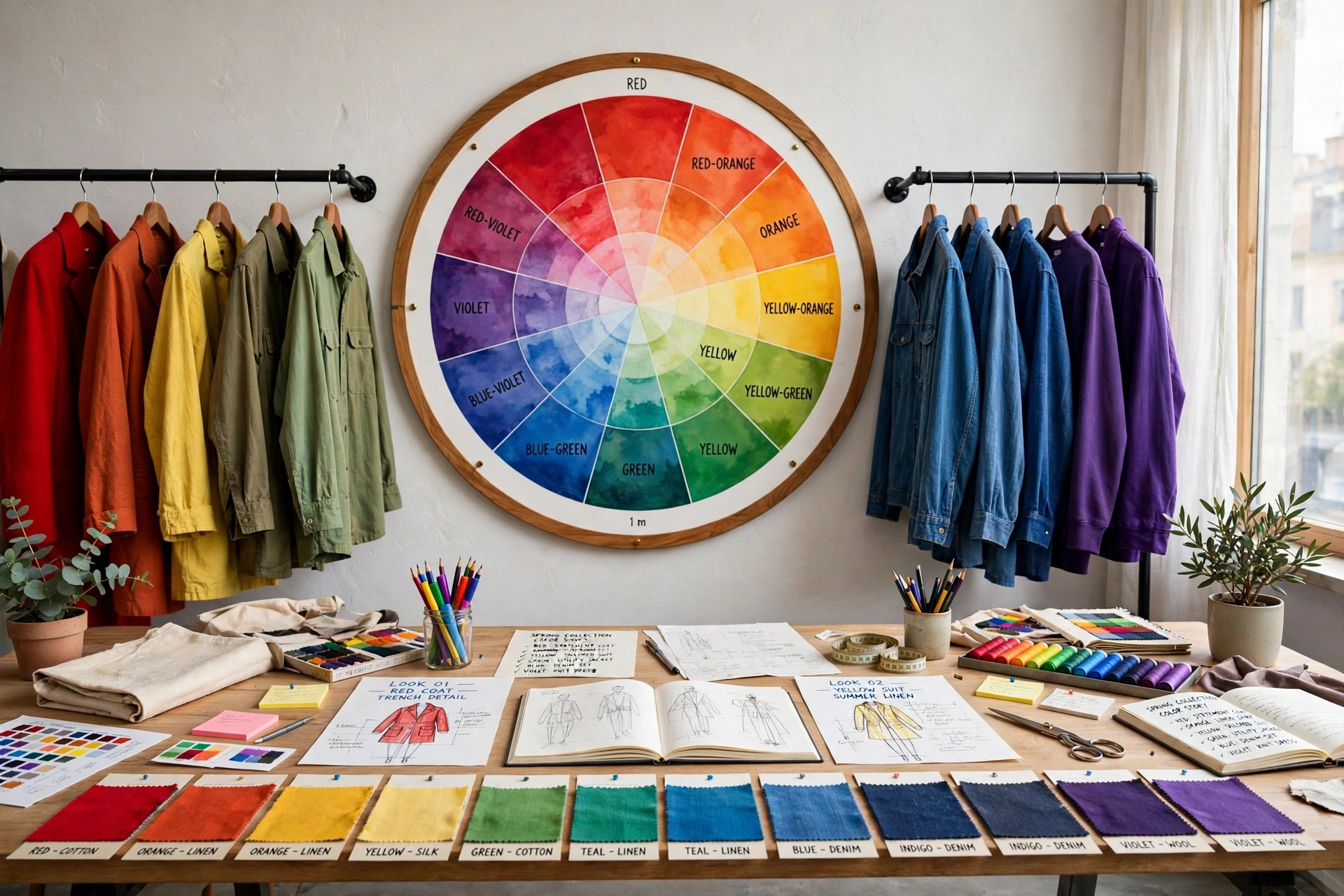
Seasonal palettes, covered in the Seasonal Color Analysis Guide, tell you which colors suit you. Color theory for dressing answers the next question: once you have the colors, how do you combine them in an outfit so the result looks deliberate rather than accidental? The good news is that the whole craft rests on the same three dimensions — hue, value and chroma — plus a handful of classic harmonies that stylists reach for again and again.
The Three Dimensions, Put to Work
Hue is the color family itself: red, blue, green, and everything around the wheel. Value is lightness — the difference between navy and powder blue, or burgundy and pink, is mostly value. Chroma is saturation — the difference between a clear emerald and a greyed sage. Outfit combinations work when at least one of these dimensions is shared or deliberately contrasted. Two colors of similar value and chroma almost always sit comfortably together, whatever their hues; a clash usually comes from chroma, when one clear, saturated piece makes a muted piece look dirty by comparison — the reason a bright Winter top can ruin a soft Autumn skirt even in a "matching" color.
The Classic Harmonies
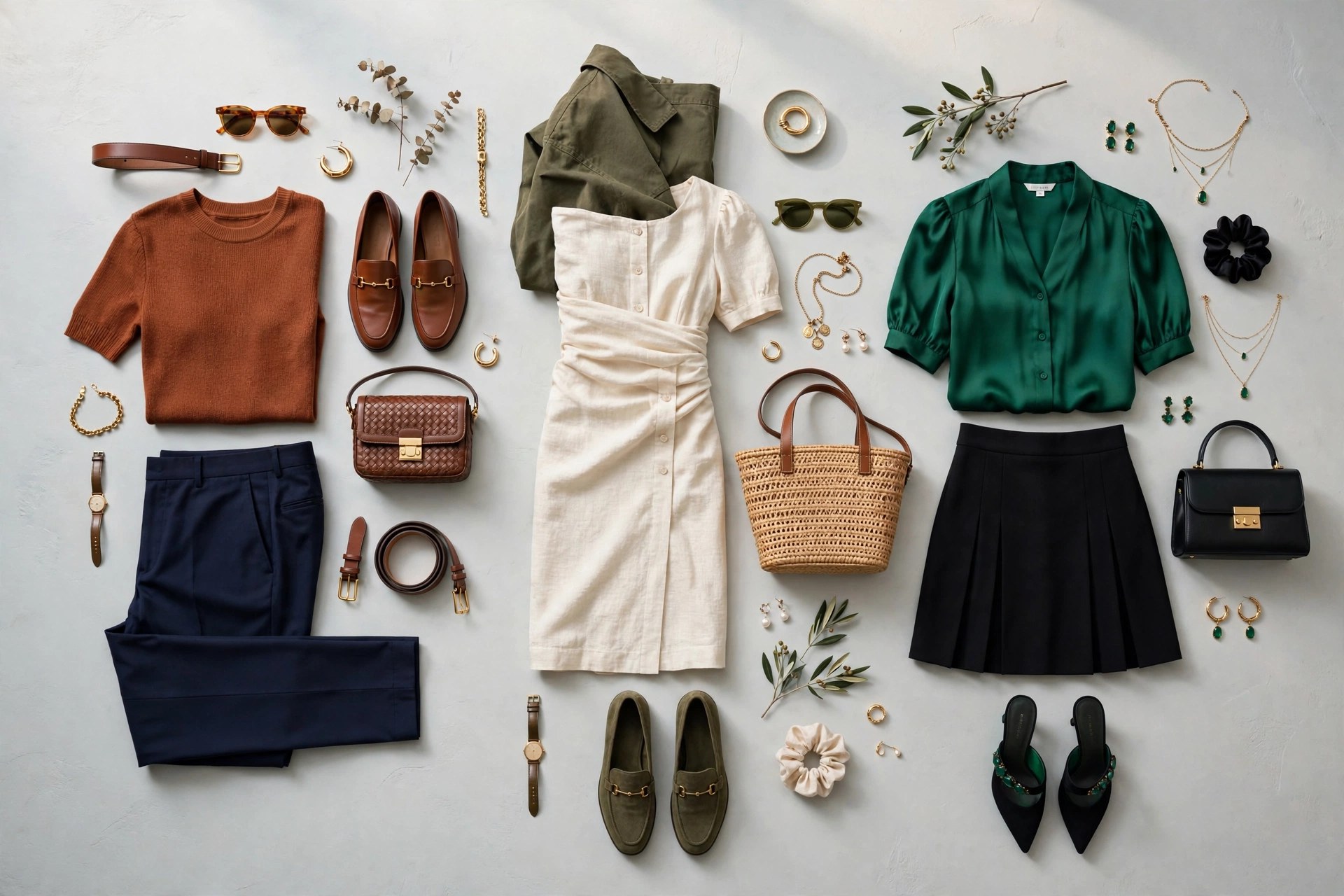
Monochromatic dressing uses one hue in several values — navy trousers, a mid-blue top, a pale blue scarf. It is the most reliably elegant scheme and lengthens the body because the eye travels without interruption. Analogous combinations use neighboring hues — blue with teal and green, or rust with mustard and olive — and feel rich and harmonious; most seasonal palettes are built largely of analogous families, which is why palette wardrobes mix so easily. Complementary pairs sit opposite on the wheel — blue with orange, red with green, purple with yellow — and create the most energy; the trick is proportion, letting one dominate and the other accent. Triadic schemes use three evenly spaced hues (the classic red-yellow-blue, or the more wearable burgundy-mustard-teal) and suit confident dressers. Finally, the neutral-plus-accent scheme — an all-neutral outfit with one saturated color in a top, shoe or bag — is the working formula behind most successful everyday dressing.
Neutrals: The Working Foundation
Neutrals do most of the work in a real wardrobe, and they are not seasonless: each season has its own white, its own dark neutral, and its own mid-tones. Winter's are black, optical white and navy; Summer's are soft white, grey and soft navy; Autumn's are cream, chocolate and camel; Spring's are ivory, warm navy and golden tan — one reason the individual palette guides (Spring, Summer, Autumn, Winter) list neutrals first. A practical rule: buy your expensive, long-worn pieces — coats, trousers, boots — in your season's neutrals, and take your color risks in tops, knitwear and accessories that sit closer to the face and cost less to replace.
Proportion and Placement
Where color sits matters as much as which color it is. Colors near the face have the most effect on how you look, which is why palette discipline matters most for tops, scarves, hats and makeup, and least for trousers, skirts and shoes. Within an outfit, a 70/20/10 split — a dominant color, a supporting color, and a small accent — keeps combinations balanced; even splits of two strong colors can look like a uniform or a sports kit. Contrast level should also match your own: high-contrast coloring repeats itself best in high-contrast outfits (Winter's black and white), while low-contrast, blended coloring is flattered by tonal, low-contrast combinations (Soft Summer's grey-blue on dusty rose). The how-to-style guides apply these principles garment by garment, from blazers to slip dresses.
Finally, build around what you own. A capsule wardrobe planned on one palette and one or two harmonies will produce more outfits from fewer pieces than a closet of unrelated bargains — and when you add a garment, the simple test from finding your season applies: does it share value and chroma with the rest of your wardrobe? If yes, it will earn its keep.
Common Questions
What is the easiest color combination for an outfit?
A monochromatic combination — one hue in light, medium and dark versions — is the hardest to get wrong, because value changes alone create depth without any clash of hue or chroma. The neutral-plus-accent scheme (mostly neutrals, one strong color) is a close second and the most common formula in everyday dressing.
How many colors should an outfit have?
Three is a reliable ceiling for most outfits: a dominant color covering most of the outfit, a supporting color, and one accent at roughly ten percent — often a shoe, bag or scarf. Tonal outfits can use more shades of one family because they read as a single color story.
Why do two 'matching' colors sometimes clash?
Usually because their chroma or undertone differs: a bright, clear version of a color makes a muted version of the same hue look dirty, and a warm version fights a cool one. Check value and chroma, not just hue, and hold the pieces together in daylight before deciding.
Should my outfit contrast match my own contrast level?
As a starting rule, yes. High-contrast coloring (typical of Winter seasons) is flattered by high-contrast outfits, while blended, low-contrast coloring (typical of Soft Summer and Soft Autumn) looks best in low-contrast, tonal combinations. It is a tendency to test in the mirror, not a law.
Back to the Seasonal Color Analysis Guide
The Seasonal Color Analysis Guide hub maps the whole twelve-season system — all four seasons, every sub-season palette, and how the pieces of this cluster fit together.