2006 Pantone Color of the Year: Sand Dollar
Sand Dollar 13-1106 — the warm, natural neutral that won in a year of economic worry.
The boldest choice can be the quietest color. For 2006, after years of sky blues, hot pinks, reds and oranges, Pantone named a neutral: Sand Dollar 13-1106, a warm, pale sandy beige. The reasoning was candid — the color was said to express concern about the economy, a shade chosen for a public counting its money.
Pantone acknowledged the oddity itself: while most other Colors of the Year are brighter, this neutral shade is warm. That warmth is what kept Sand Dollar from feeling like surrender. Named for the bleached shell found on beaches, it connected caution to nature rather than to austerity, and it fed directly into the period's growing trend of the natural and organic — undyed-looking fibers, honest materials, and clothes that promised to last rather than to dazzle.
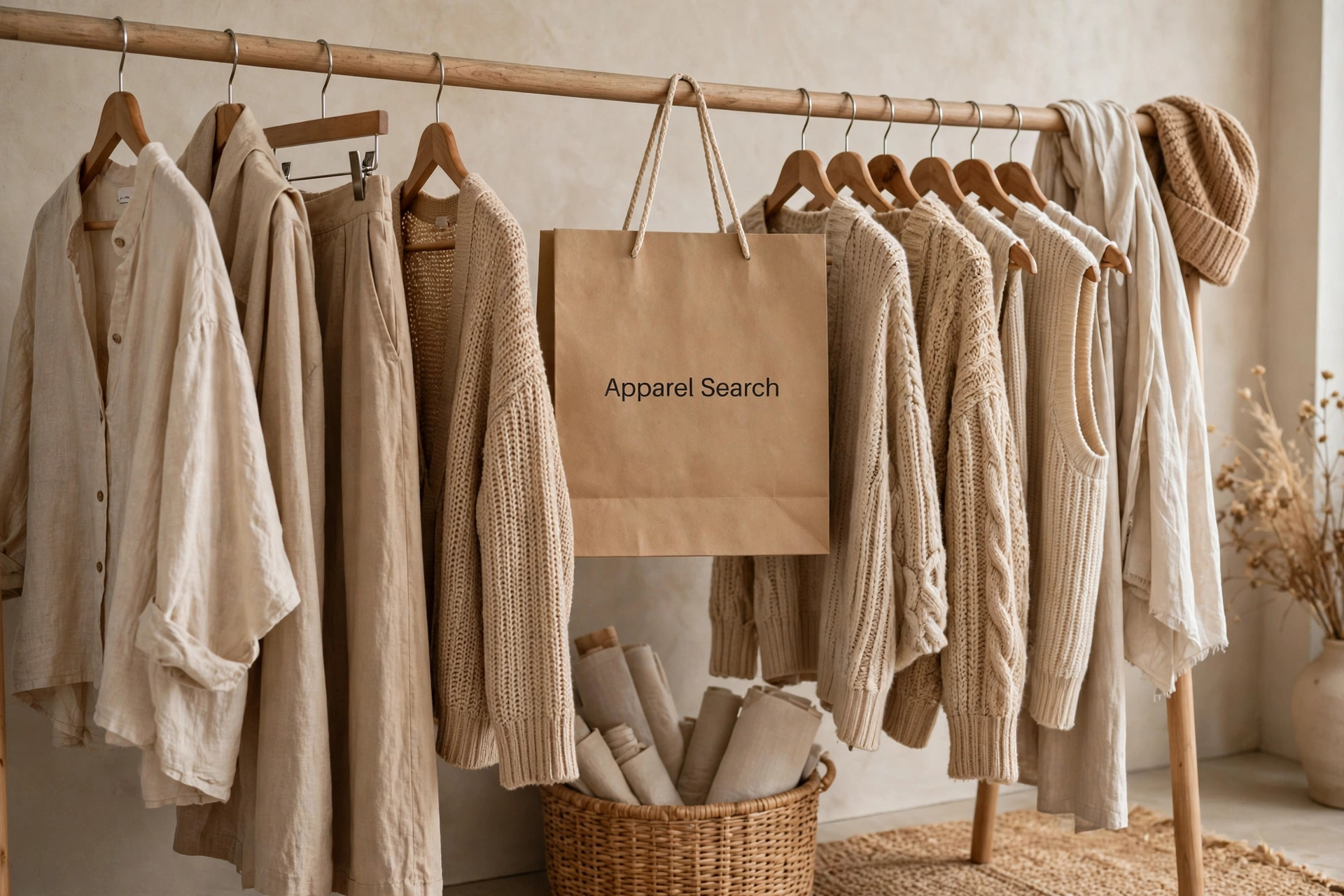
The Year Caution Won
Every Color of the Year reads its moment, and 2006's moment was financial unease. Picking a beige in such a year is a more honest forecast than picking a party color: it predicts what people will actually buy when budgets tighten — versatile, repeatable, inconspicuous quality. Sand Dollar proposed that the fashionable response to worry was not drabness but discernment: fewer pieces, better chosen, in a color that would still look right when the economy turned.
There is commercial wisdom in the choice as well. Bright statement colors date quickly, which is a liability when shoppers intend to wear purchases for years. A warm neutral is effectively trend-proof, and a Color of the Year that retailers could sell as a classic rather than a fad suited 2006's retail reality precisely.
A Warm Neutral, Not a Cold One
Neutrals divide by temperature, and Sand Dollar sits firmly on the warm side — sand, shell, unbleached linen, pale driftwood. Warm neutrals behave differently from the cool grays and taupes of corporate dressing: they soften tailoring, flatter the face in the way candlelight does, and combine gracefully with the earth palette of browns, olives and creams. The shade's slight depth keeps it from the starkness of white while retaining white's freshness.
Texture is everything at this paleness. In flat synthetic fabric Sand Dollar can look merely plain; in linen, raw silk, suede, cashmere or a nubby weave it becomes luxurious, because the eye reads the material through the quiet color. The natural and organic trend Pantone cited supplied exactly those textures, which is why shade and movement fitted each other so well that year.
Building a Wardrobe on Sand Dollar
This is the rare Color of the Year that works hardest in the largest pieces. A Sand Dollar coat goes over everything. Trousers and skirts in the shade extend the leg and accept any top. Knitwear in it is the definition of quiet luxury, and suiting in it reads confident and expensive in warm months. Because it offends nothing, it also multiplies a wardrobe: every strong color a person already owns gains a new partner.
For combinations, stay in the family first — cream, camel, tan and chocolate make the tonal, layered look that defines sophisticated neutral dressing. Then borrow contrast from the deep end: navy, burgundy and forest green all sharpen against Sand Dollar, and black, used carefully, turns it urban. Metallic gold keeps it warm; silver cools it. A wardrobe anchored here rarely looks wrong, which is, in the end, what a worried year wanted from its color.
Photos

Common Questions
Why did Pantone pick a neutral in 2006 instead of a bright color?
Because the mood it was reading was anxious, not exuberant. Sand Dollar was described as a neutral color that expresses concern about the economy — a shade for a moment when consumers were cautious. Where most other Colors of the Year are brighter, this warm neutral matched a public instinct to buy carefully, choose lasting things, and avoid anything that looked frivolous.
Is Sand Dollar just beige?
Beige is its family, but the name and the warmth are the point. Sand Dollar 13-1106 is a warm, pale, sandy neutral — closer to the bleached shell it is named for than to a gray office beige. Its warmth keeps it flattering against skin and natural beside organic fibers, and it was explicitly tied to the trend toward the natural and organic rather than to corporate dressing.
What is the best way to use a neutral Color of the Year in a wardrobe?
As the foundation, not the accent. Sand Dollar earns its keep in coats, trousers, knits and suits — the pieces everything else in the closet must get along with. Build the base in this warm neutral, then let stronger colors, including earlier Colors of the Year, rotate through as tops, scarves and accessories. That is how a cautious-year color quietly becomes the most-worn one.