2008 Pantone Color of the Year: Blue Iris
Blue Iris 18-3943 — a beautifully balanced blue-purple: dependable blue, soul-searching purple, a touch of magic.
For 2008, Pantone chose the border where blue becomes purple — and chose it, unusually, in the language of professional forecasting. Blue Iris 18-3943 was described as a beautifully balanced blue-purple, selected, Leatrice Eiseman explained, because from a color forecasting perspective it best represented color direction in 2008 for fashion, cosmetics and home products.
The emotional reading followed the visual one. As a reflection of the times, Blue Iris brings together the dependable aspect of blue, underscored by a strong, soul-searching purple cast. Emotionally, Pantone said, it is anchoring and meditative — with a touch of magic. After 2007's appetite and adventure, the program turned inward again, toward a color that promised steadiness without surrendering mystery.
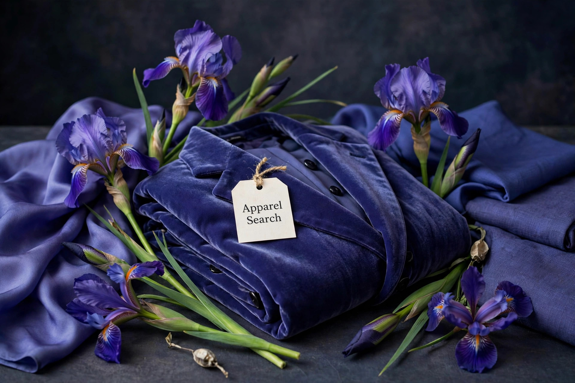
Dependable Blue, Soul-Searching Purple
Blue and purple carry nearly opposite reputations. Blue is the world's most trusted color — corporate, calm, reliable, the shade of uniforms and clear skies, and the family Pantone had already used for calm in 2000 and 2003. Purple is blue's introspective sibling: historically rare and costly, associated with spirituality, imagination and the unconventional. A balanced blue-purple therefore lets a wearer send both signals at once, which suited a year when people wanted stability that did not feel sterile.
The meditative quality Pantone claimed for the shade is visible in how it behaves in a room or an outfit: it lowers the energy without lowering the interest. Unlike gray or beige calm, Blue Iris calm keeps a pulse of the mystical — the 'touch of magic' in the announcement — which is why it translated so readily into cosmetics, where iris-toned shadows and liners offered exactly that steadiness-with-wonder at the smallest possible scale.
The Pairings Pantone Published
Most Color of the Year announcements leave styling to the reader; the 2008 announcement did the styling itself. Look for Blue Iris, Eiseman said, artfully combined with deeper plums, red-browns, yellow-greens, grapes and grays. Each partner steers the shade somewhere different, and together they map its full territory better than any single description could.
Deeper plums and grapes push Blue Iris toward evening richness, a tonal purple family with depth at both ends. Red-browns ground it in earth, an unexpectedly warm frame that makes the purple cast glow. Yellow-greens are the electric option — near-opposites that set up the vibrating contrast fashion editorials love. Grays are the diplomat's choice, muting the magic into something a conservative office can wear. A single garment color that can take all four directions is rare, and it explains why forecasters saw the shade everywhere that year.
Wearing the Balanced Blue-Purple
Blue Iris flatters in the way of most saturated mid-dark colors: it has enough presence to hold a silhouette and enough blue to stay composed. Dresses and evening tops are its showcase pieces, especially in fabrics that shift between its two parents as they move — silk, satin and fine crepe can look bluer in one light and purpler in another, a living demonstration of the balance Pantone named it for. Knitwear in the shade is rich without heat, a useful quality in transitional seasons.
For the cautious, Blue Iris is an ideal accessory color: a bag, shoe or scarf in blue-purple updates a wardrobe of black, gray and navy instantly, and its published partners double as a shopping list for companions. Jewelry in iris tones — amethyst, tanzanite, blue topaz — sits in the same family. It remains the program's most explicitly forecast-driven selection, and one of its most wearable: anchoring, meditative, and just magical enough to notice.
Photos

Common Questions
Why did Pantone call Blue Iris the color direction for 2008?
Leatrice Eiseman said that from a color forecasting perspective, Blue Iris was chosen as the color of the year because it best represented color direction in 2008 for fashion, cosmetics and home products. It was presented less as a single trend item and more as the shade the whole season's palettes were converging toward — a forecaster's pick backed by what was already moving through collections.
What two color personalities does Blue Iris combine?
Blue's dependability and purple's soul-searching depth. Eiseman described the dependable aspect of blue underscored by a strong, soul-searching purple cast, producing a color that is emotionally anchoring and meditative, with a touch of magic. That blend is why the shade can feel trustworthy at work and mysterious in the evening — it literally contains both messages.
What colors did Pantone suggest combining with Blue Iris?
The announcement named them: deeper plums, red-browns, yellow-greens, grapes and grays. The list is a lesson in the shade's range — rich purples deepen it, warm browns and yellow-greens set up lively contrasts, grape tones make it tonal, and gray calms it into something businesslike. Few Colors of the Year arrived with such a complete pairing map.