2011 Pantone Color of the Year: Honeysuckle
Honeysuckle 18-2120 — a reddish pink with energy, and a glow wearers keep.
The Pantone Color of the Year for 2011 was Honeysuckle, PANTONE 18-2120 — a dynamic reddish pink named for the flower. Where a pastel pink soothes, Honeysuckle energizes: it is a striking, eye-catching hue, and Pantone promised it would produce a healthy glow when worn by both men and women.
It works well for day and night in women's apparel, accessories and cosmetics, and in men's ties, shirts and sportswear. But the most useful part of the 2011 announcement was not the praise — it was the recipes. Pantone published exact combinations for wearing the color, from safe basics to a bronze-green pairing that still looks sophisticated now.
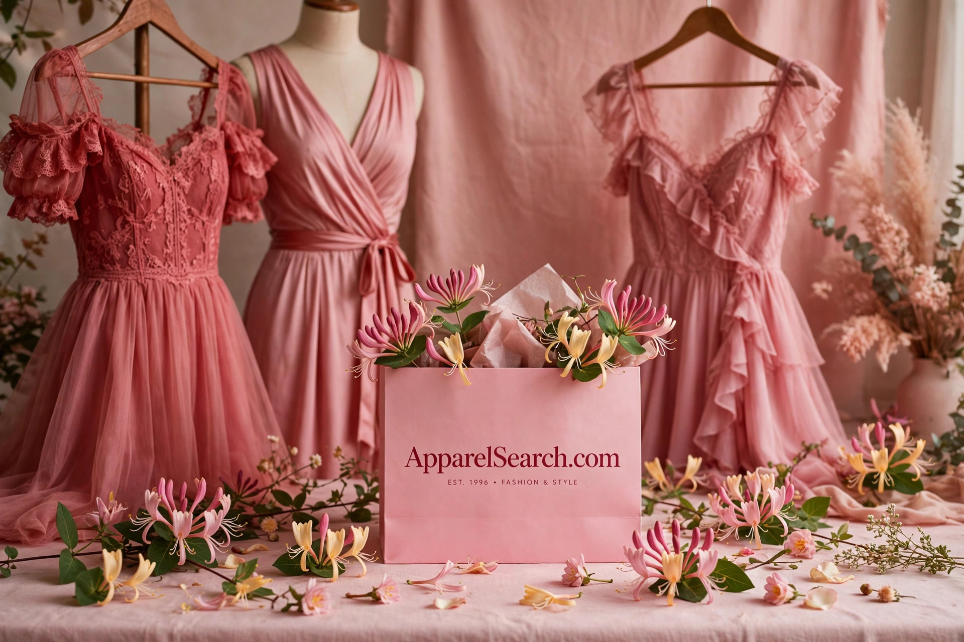
Start With the Basics, Then Go Bronze
Honeysuckle always works with the standard basics of black, navy, charcoal or light to mid gray — the dependable neutrals let the pink carry the outfit, and a Honeysuckle dress against charcoal or a Honeysuckle shirt under a navy blazer needs no further invention. That safety is the floor of the color, not its ceiling.
The ceiling is bronze green. Using complementary bronze greens like Willow PANTONE 16-0632 and Tapenade PANTONE 18-0840 adds a new sophistication to the combination that showcases the energy of Honeysuckle — the green tones can be really interesting in accessories for Honeysuckle tights and a top. The logic is classic color theory with the volume adjusted: pink and green are near-complements, but muting the green to an olive-bronze keeps the pairing grown-up instead of candy-striped.
The Apricot Brandy Combination
Pantone's second recipe is warmer and more original: Honeysuckle with a pinkish brown like Apricot Brandy PANTONE 17-1540. Think of a warm cashmere turtleneck in Apricot Brandy with a matching skirt and shoes to blend and flatter the legs — then a Honeysuckle cashmere scarf and belt create a luscious combination. The brown-pink base flatters and elongates; the Honeysuckle accents land exactly where the eye should go.
And to blend all the colors, try a big and bold patterned bag with every color mentioned above — the print acts as the treaty between pink, bronze green and pinkish brown, proving they belong in one outfit. It is a complete styling lesson inside a color announcement: base, complement, accent, and a print to marry them.
Day, Night and the Glow
Honeysuckle's working range is wide because its saturation survives every context. In daylight it reads fresh on cotton dresses, knit tops and sportswear; after dark the same hue deepens under artificial light and holds up in silk and satin. In cosmetics it became a blush and lipstick family that mimics the flush Pantone promised from the clothing — the healthy glow, applied directly.
Accessories are the low-commitment route: tights, a scarf, a belt or a bag in 18-2120 refresh a wardrobe of basics for the price of one piece. That is the enduring lesson of the Honeysuckle year — a Color of the Year earns its title not by demanding a new wardrobe, but by giving the old one a pulse.
One caution belongs with a color this saturated: Honeysuckle photographs hotter than it wears, and screen images of 18-2120 often exaggerate its red. In person the shade is vivid but skin-friendly, closer to the flower than to neon — which is why it survived its year in real wardrobes instead of living only in editorial photographs and runway recaps.
Photos


Common Questions
How is Honeysuckle different from an ordinary pink?
It has red in its engine. Honeysuckle 18-2120 is a reddish pink with the saturation turned up, so instead of reading sweet or pale it reads energetic — a striking, eye-catching hue that holds its own for day and night rather than whispering.
Which greens did Pantone pair with Honeysuckle?
Bronze greens, specifically Willow PANTONE 16-0632 and Tapenade PANTONE 18-0840. Their muted, olive depth adds a new sophistication against Honeysuckle's brightness, and the greens work especially well in accessories worn with Honeysuckle tights and a top.
Can men wear Honeysuckle?
Yes — Pantone placed it in men's ties, shirts and sportswear, where a reddish pink reads as confident rather than novelty. It is also one of the shades said to produce a healthy glow when worn by both men and women.