2009 Pantone Color of the Year: Mimosa
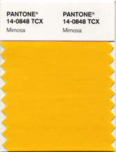
Mimosa 14-0848 — a warm, engaging yellow carrying the reassurance of sunlight into a hard year.
In the depths of a financial crisis, Pantone prescribed sunshine. Mimosa 14-0848, the Color of the Year for 2009, is a warm, engaging yellow — the program's first true yellow — chosen as an antidote. Where 2006's Sand Dollar had expressed economic concern in beige, 2009 answered economic fear in gold.
Leatrice Eiseman set out the reasoning: the color yellow exemplifies the warmth and nurturing quality of the sun, properties we as humans are naturally drawn to for reassurance. Mimosa also speaks to enlightenment, she added, as it is a hue that sparks imagination and innovation. The shade takes its name from the mimosa flower — and, unavoidably, from the brunch cocktail — both associations landing on the same note of gathered, golden sociability.

Reassurance as a Color Strategy
The 2009 selection is the clearest case in the program of color prescribed as public medicine. Pantone did not claim yellow was merely trending; it claimed yellow was needed. Sunlight is the one luxury a recession cannot repossess, and a yellow garment or room imports its psychology — warmth, nurture, the promise that the season turns. Fashion took the hint in the spirit offered: Mimosa appeared as the bright note in otherwise careful collections, optimism rationed into single pieces.
The enlightenment half of the rationale deserves equal weight. Yellow has long signified intellect and illumination, and Pantone tied Mimosa to imagination and innovation at a moment when economies were being told to innovate their way out. A color that could mean both comfort and bright ideas was a unusually complete emblem for its year.
A Yellow Engineered to Be Likable
Yellow is fashion's most feared color family, accused of sapping complexions and shouting from the rail. Mimosa answers those fears in its construction: it is warm rather than acid, golden rather than lemon, with enough depth to sit beside skin kindly. It recalls egg yolk, marigold and late light more than it recalls signage. That warmth is what lets it behave almost like a neutral with a pulse — strong in identity, yet, as Pantone noted, genuinely coordinating with any other color.
The shade also shifts gracefully by material. In cotton and linen it is summery and democratic; in silk it turns festive; in small leather goods it reads as a deliberate luxury accent, the yellow bag or wallet that organizes an outfit of quieter pieces around a single sunny decision. Few yellows can work at so many price points and occasions without changing character.
Where Pantone Expected to See It
Unusually, the 2009 announcement published its own sightings forecast: look for women's accessories, home furnishings, active sportswear and men's ties and shirts in this vibrant hue. The list is a map of yellow's safest and happiest territories. Accessories take the color in doses anyone can manage. Active sportswear borrows its visibility and energy. Men's ties and shirts — the classic places where conservative dressing permits color — gave Mimosa a route into wardrobes that would never have bought a yellow suit.
All of it translates to both fashion and interiors, as Pantone promised, and the decade that followed proved the shade's range: it recurred in spring collections, kitchenware and branding whenever warmth needed signaling quickly. Mimosa closed the program's first decade by completing its emotional circle — the calm of 2000, the grief of 2002, the caution of 2006, and finally, deliberately, hope in yellow.
Photos
Common Questions
Why did Pantone choose a cheerful yellow for 2009, of all years?
Precisely because it was a hard year. Leatrice Eiseman explained that yellow exemplifies the warmth and nurturing quality of the sun, properties humans are naturally drawn to for reassurance. With the economy in crisis, Pantone prescribed sunlight: a hue meant to steady nerves, and one that also speaks to enlightenment, sparking imagination and innovation when both were badly needed.
Is Mimosa a color for women only?
Emphatically not, and the announcement said so. Mimosa was described as a versatile shade with appeal for men and women alike, and Pantone specifically expected it in men's ties and shirts as well as women's accessories. Yellow has no gender in nature — sunlight falls on everyone — and 2009's styling treated the shade as a shared resource rather than a womenswear novelty.
What does Mimosa go with?
According to Pantone, essentially everything: it is a versatile shade that coordinates with any other color. In practice it is warmest beside neutrals, denim, navy and gray, liveliest beside purple and blue, and most elegant in small, deliberate placements — an accessory, a tie, a shirt — where its sunshine reads as optimism rather than volume.