2019 Pantone Color of the Year: Living Coral
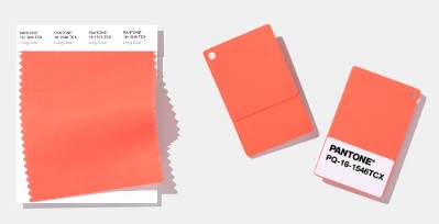
Living Coral 16-1546 — vibrant yet mellow, a coral with a golden undertone.
The 2019 Pantone Color of the Year is PANTONE 16-1546 Living Coral. Vibrant, yet mellow, Living Coral embraces us with warmth and nourishment to provide comfort and buoyancy in our continually shifting environment — a shade chosen as much for how it treats people as for how it looks.
It is a life-affirming coral hue with a golden undertone that energizes and enlivens with a softer edge. Sociable and spirited, the engaging nature of Living Coral welcomes and encourages lighthearted activity, and symbolizing our innate need for optimism and joyful pursuits, it embodies our desire for playful expression.

An Answer to Screen Life
Pantone stated the diagnosis behind the choice directly: in reaction to the onslaught of digital technology and social media increasingly embedding into daily life, we are seeking authentic and immersive experiences that enable connection and intimacy. Living Coral is the color of the unplugged world in that argument — reef, sunset, ripe fruit, a flushed face across a table — things that exist in person.
That framing explains the shade's unusual emotional register. Many Colors of the Year aim at energy or luxury; this one aims at company. It is the color of gatherings, shared meals and holidays, and its warmth is social rather than thermal. In a year of feeds and notifications, Pantone picked the hue of being in the room.
The Golden Undertone Does the Work
Coral can go wrong in two directions — chalky pink or traffic orange. Living Coral avoids both through gold. The golden undertone warms the pink and softens the orange, producing the "vibrant, yet mellow" balance Pantone described, and it is what makes the shade so wearable: gold-leaning colors sit kindly on most skin, lending the wearer some of the color's own glow.
In fabric the undertone favors natural, light-catching materials. Linen and cotton gauze keep Living Coral breezy for high summer; silk takes it to weddings and evening, where it reads as the joyful alternative to red; fine knits carry it into the shoulder seasons against cream and soft gray. Swimwear and resort pieces, inevitably, were its first home — the reef reference made literal at the water's edge.
Pairings for a Sociable Color
Living Coral's natural partners come from its own habitat. Deep teal and turquoise — the reef water around the coral — set it off by contrast, a pairing that has decorated tropical prints for a century. Navy gives it a classic, almost nautical discipline. White makes it summery and graphic; warm sand and tan let it glow quietly; and gold jewelry simply extends the undertone the color already owns.
Beauty adopted it as quickly as fashion did, because a coral blush or lipstick manufactures exactly the healthy, lighthearted flush the color symbolizes. That may be Living Coral's most complete success: a Color of the Year whose clothes, cosmetics and stated philosophy all say the same sentence — go outside, gather people, enjoy it in person.
For anyone adding the color gradually, the order of operations is forgiving: shoes or a bag first, then a knit or shirt, then — once the shade has proven itself against everything else in the closet — the full coral dress or suit. Living Coral rarely disappoints in small doses, which is why so many wearers ended the year owning more of it than they planned.
Photos
Common Questions
Why is it called Living Coral?
Because it is a life-affirming coral hue — Pantone presented 16-1546 as the color of living reef coral, with a golden undertone that energizes and enlivens with a softer edge. The name ties the shade to something alive and worth caring for, not just to a pink-orange mixture.
What was Living Coral chosen in reaction to?
The onslaught of digital technology and social media increasingly embedding into daily life. Against that, Pantone said people are seeking authentic and immersive experiences that enable connection and intimacy — and chose a sociable, spirited color that welcomes lighthearted activity.
Is Living Coral a pink or an orange?
It lives between them, and the golden undertone decides its character: warmer and softer than a blue-pink, gentler than a true orange. That in-between position is why it flatters so many skin tones and slides between seasons — vibrant, yet mellow by design.